Some graphics work, 2024-Q1
Tales from the first quarter...
Spring is officially here, so it's time for an update on some of the visual journalism I've produced at AFP over the past few months.
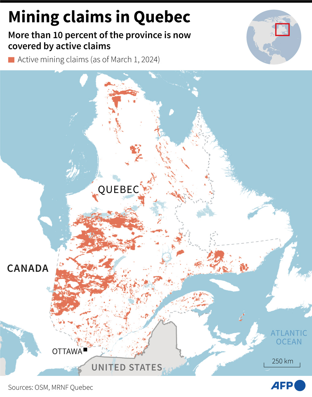
I've posted a few graphics below that I like because of the color scheme, or the topic, or both. Most of them are made with either Python or R, as usual, and finished in Adobe Illustrator. I also took on a few mapping projects which were made with QGIS.
It was fun to start learning more about geospatial data, and my first experiments were enough to see that QGIS is both complex and powerful. I've still got a long way to go with it, but there's something nice about doing visualization work that feels more directly connected to a sense of place.
I also worked on some more in-depth projects that didn't have a direct graphical output, which I'll write about in some future posts.
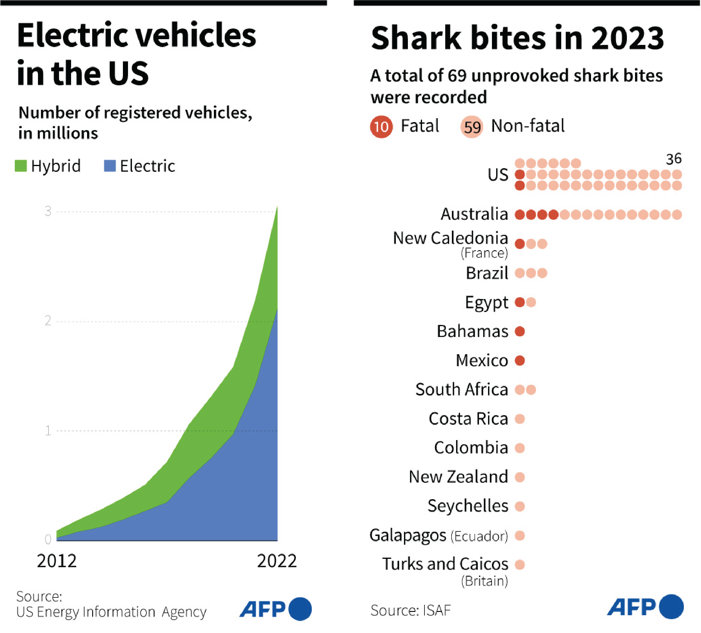
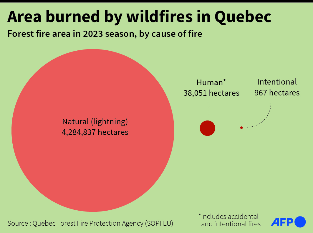
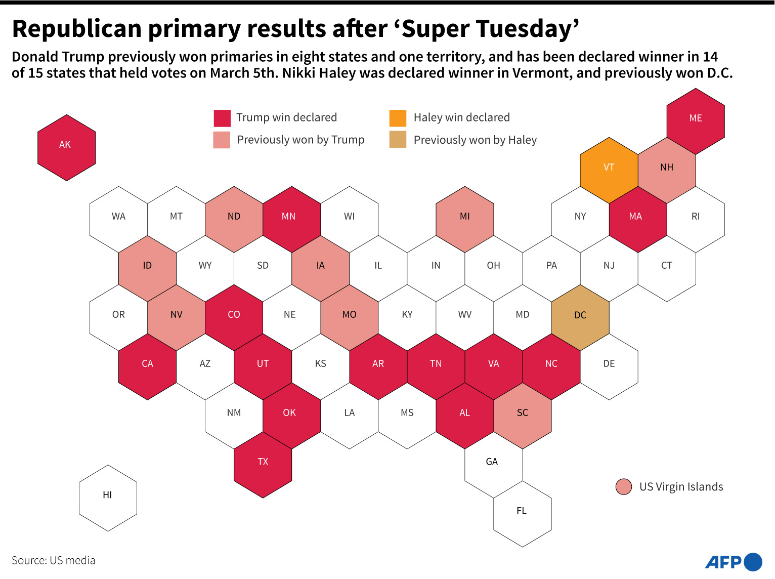
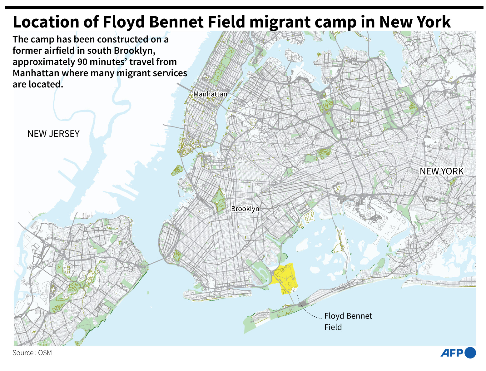
For now here are the charts: