Rotate x axis labels in Seaborn plot
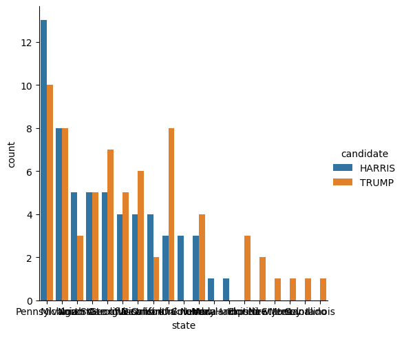
When creating a plot with the Seaborn data visualization library for Python, labels on the x axis often overlap to the point of being unreadable:

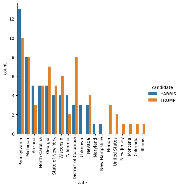
We can fix this by rotating the labels 90° so that text displays vertically. This can be done by appending .set_xticklabels(rotation=30) to the end of the Seaborn grid object.
E.g.
sns.catplot(
    x="state",
    y="count",
    hue="candidate",
    data=visits,
    kind="bar",
).set_xticklabels(rotation=90)
For a much better result:
